Cannabis packaging is just one of many unique challenges facing the Canadian cannabis industry ever since its legalization in 2018.
Current regulations on cannabis branding and packaging are set by Health Canada to protect youth, illicit drug-related activities, and public health and safety. Their rigidity and restrictive nature are designed with these objectives in mind, so it’s clear to see why packaging remains an important factor to consider in staying compliant.
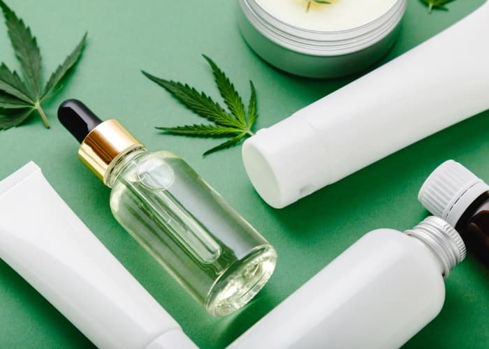
Cannabis Packaging Overview.
As with any commercial product, branding is an important element that differentiates products from one another. In the cannabis industry, brand elements such as names, trademarks, and logos follow strict guidelines that make product branding a difficult challenge.
Currently, cannabis packaging brand elements must not include:
- Appeals to youth or underage consumers
- Testimonials or endorsements
- Depictions of real or fictional people, characters, and animals
- Lifestyle associations. Examples include recreation, health, and success
- Misleading/false impressions regarding product strength, value, quantity, concentration, purity, health benefits and health risks
- Any resemblance to Canada’s standardized cannabis symbol
Cannabis packaging must also be:
- Opaque or translucent
- Child-proof
- One uniform colour that is non-metallic, non-fluorescent, and not in contrast with Health Canada’s warning message or cannabis symbol
- Smooth without embossing
- Showing only one brand element other than the brand name of which the sizing of must not exceed Health Canada’s warning message or cannabis symbol
Cannabis labelling must display:
- Brand name with type size not exceeding Health Canada’s warning message
- Health Canada’s warning message
- Health Canada’s cannabis symbol
With so many restrictions, branding on packaging is a struggle for many licensed producers. Depending on the price point of the product, some have opted to use opaque, zip-lock pouches with a label featuring one brand element and the name of the product.
More innovative brands have come up with creative solutions to stay compliant while also showcasing some of their personality. Here are three techniques that some licensed producers are using to give their products a bit of spice.
Colour.
While cannabis packaging must remain opaque or translucent with uniform colour, there’s still a lot of freedom in choosing which colour the packaging can use.
The Green Organic Dutchman, a Licensed Producer, based in Mississauga, Ontario (TGOD) uses vivid green colouring in their glass jars to make their products pop out on the retail shelves.
Aside from making their products more visible, the use of opaque, green glass jars also speaks to their brand identity as a whole. On their site, TGOD had this to say about their preference of glass jars over plastic:
“We’ve said to no to plastic containers from the very beginning, instead choosing to go green with recyclable glass packaging for oils and flowers and recyclable paper for shipping. We’ve also designed our glass packaging with a care that lends its hand to reusing instead of recycling. We encourage innovative ways to reduce the impact of cannabis legalization on the environment because we believe a greener cannabis industry is not only possible but essential.”
In spite of the restrictions, creative problem-solving on TGOD’s part has allowed them to market themselves as a more sustainable, eco-friendly source for organic cannabis flower.
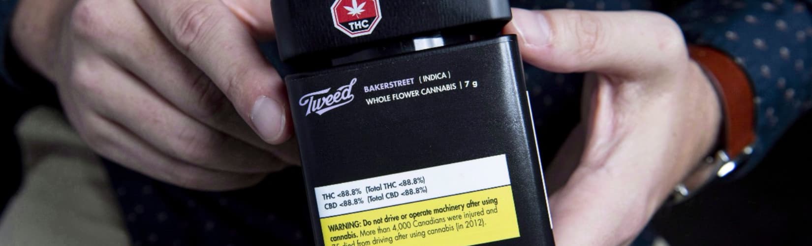
For Tweed, their use of a bulky, matte black container portrays an air of premium luxury. Even though it only stores 7 grams of dried cannabis flower within, the container is made to be bigger, allowing minimally stylistic branding of its logo, product information, place of production to be displayed.
Packaging Mechanics.
Pre-roll packaging can come in all shapes and sizes. A popular variant that many Licensed Producers utilize is a long cylinder specifically designed to house 1 to 3 pre-rolls within.
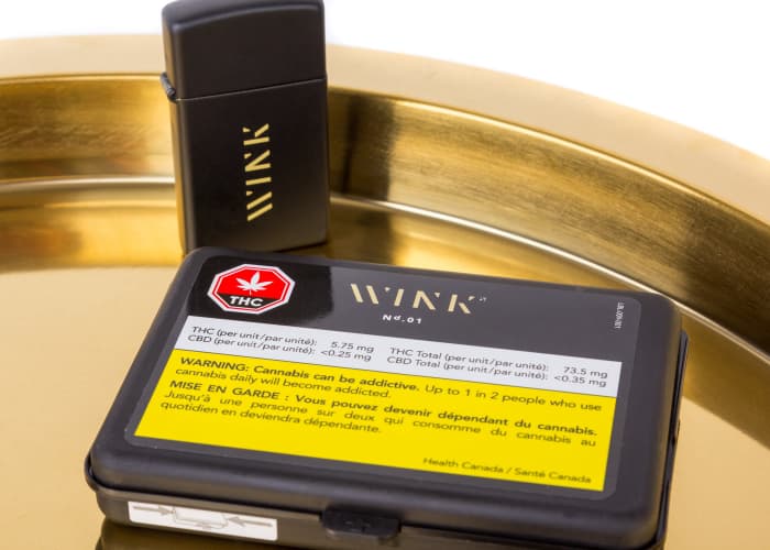
Wink Cannabis, a subsidiary of Trec Brands, has deviated from the norm with its slim, reusable pre-roll case. Stylish and aesthetically pleasing, Wink has done a great job of providing consumers with packaging that’s effective in garnering brand awareness and recognition. Consumers can reuse the reusable packaging to house other pre-roll products after the contents inside have been consumed.
The investment in increased packaging material costs upfront, as is the case with Wink Cannabis, may be costly in the short run but is ultimately worthwhile as consumers seek to reuse and recycle packaging that they find utility and style in.
Packaging Material.
Based in Toronto, Ontario, 48NORTH is a Licensed Producer that focuses on low-cost cultivation and sustainability.
To align their product design with their corporate philosophy, 48NORTH uses 100% biodegradable packaging with soy-based ink for their pre-rolls. Inside, the pre-rolls are also created with unbleached filters and papers to further promote their sustainable initiative.
Despite its unique appearance, 48NORTH’s packaging is still in compliance with Health Canada’s cannabis packaging regulations. Thinking outside the box, 48NORTH is able to simultaneously differentiate its product from its competitors while also staying true to its brand identity.
Cannabis Packaging - Creativity is a Must.
Navigating Canada’s cannabis regulations is a complicated process. It requires tenacity, flexibility, and, most importantly - creativity.
The techniques we’ve covered above and the examples included prove that thinking outside the metaphorical cannabis box is required to effectively compete in the cannabis space. Compliance is a must in the industry, but so too is effective product design and strategy.
Are you looking to stay compliant with your cannabis packaging? Contact Clout Brands to collaborate. We’d love the opportunity to take your cannabis brand to the next level.