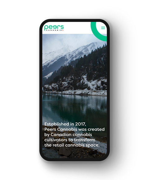
Peers Cannabis pays homage to its place of origin in Peers, Alberta, while also composing a significant part of its brand identity and story. They envisioned an eco-friendly brand with a look and feel that was open, kind, and encouraging for the cannabis space while maintaining a stylistically minimal aesthetic.
The Clout Brands team helped realize Peer Cannabis’ inclusive vision by developing a brand identity that was indicative of its welcoming nature. We established a visual and verbal messaging system that included logo, typography, brand colours, graphic elements, and media as well as guidelines on how to talk and promote the brand.
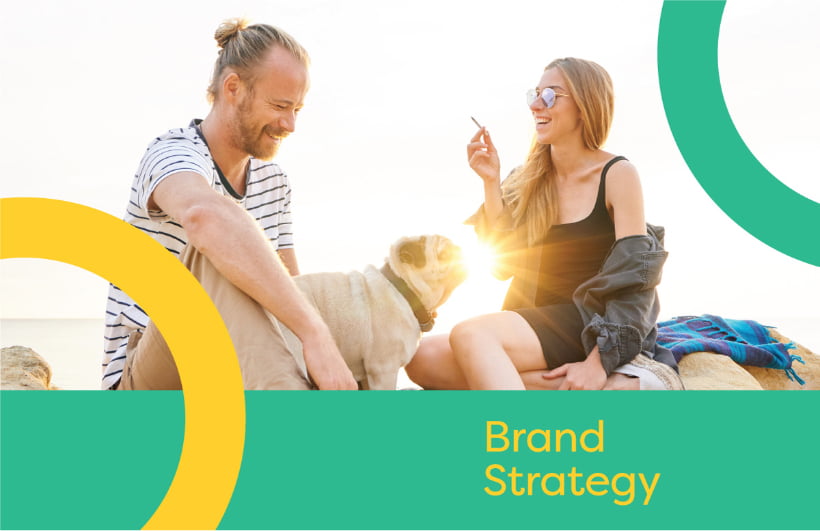
Branding.
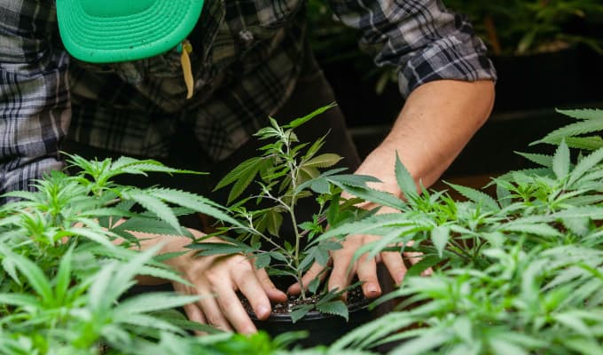
Friendly Design for Eco-friendly Growing Initiatives
The inclusiveness of Peers Cannabis is something we really leaned into during the branding process. Approachability, friendliness, and accessibility were values that loomed large for Peers Cannabis and it was something that their team had difficulty scaling in the context of federal regulations.
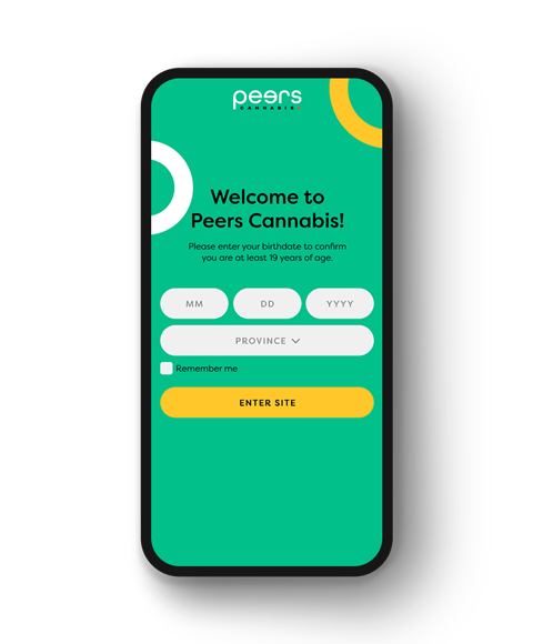
Working to stay compliant with current cannabis legislation, we helped them create a logotype that grabbed attention that could also be easily incorporated into their product packaging and marketing collateral.
Previous
Next
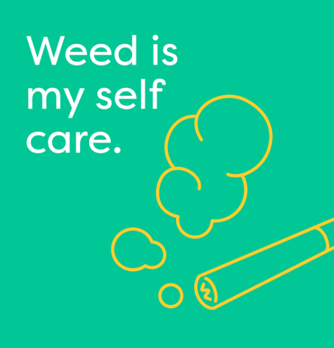
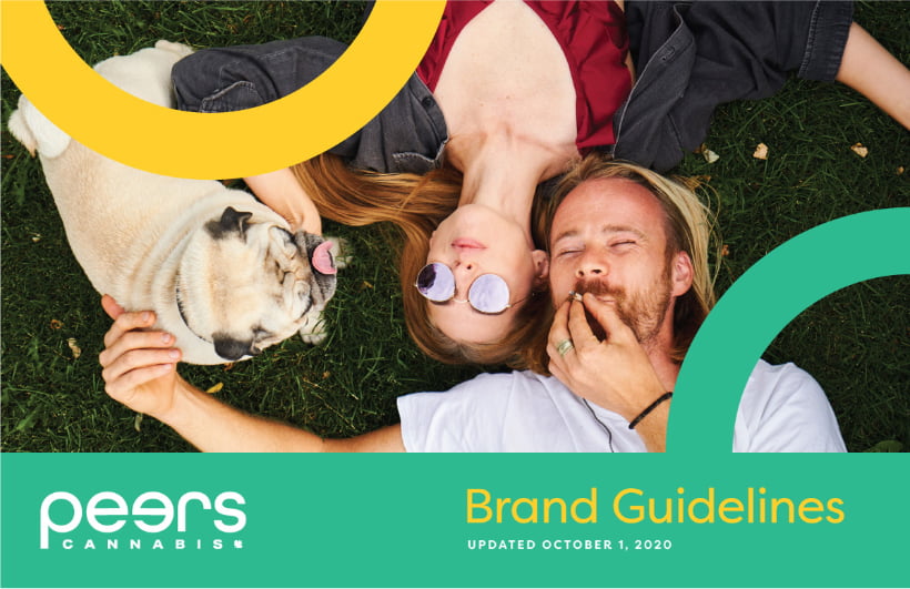
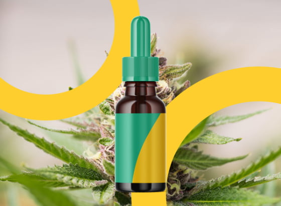
We created the Peers Cannabis circle as a graphic element to add visual interest and help keep imagery consistent across all branded material. While the circle element is a closed figure, it provided a strong brand identity that tied into the brand story we crafted for them, representing the core beliefs of inclusivity, community, and the social circles that we all share
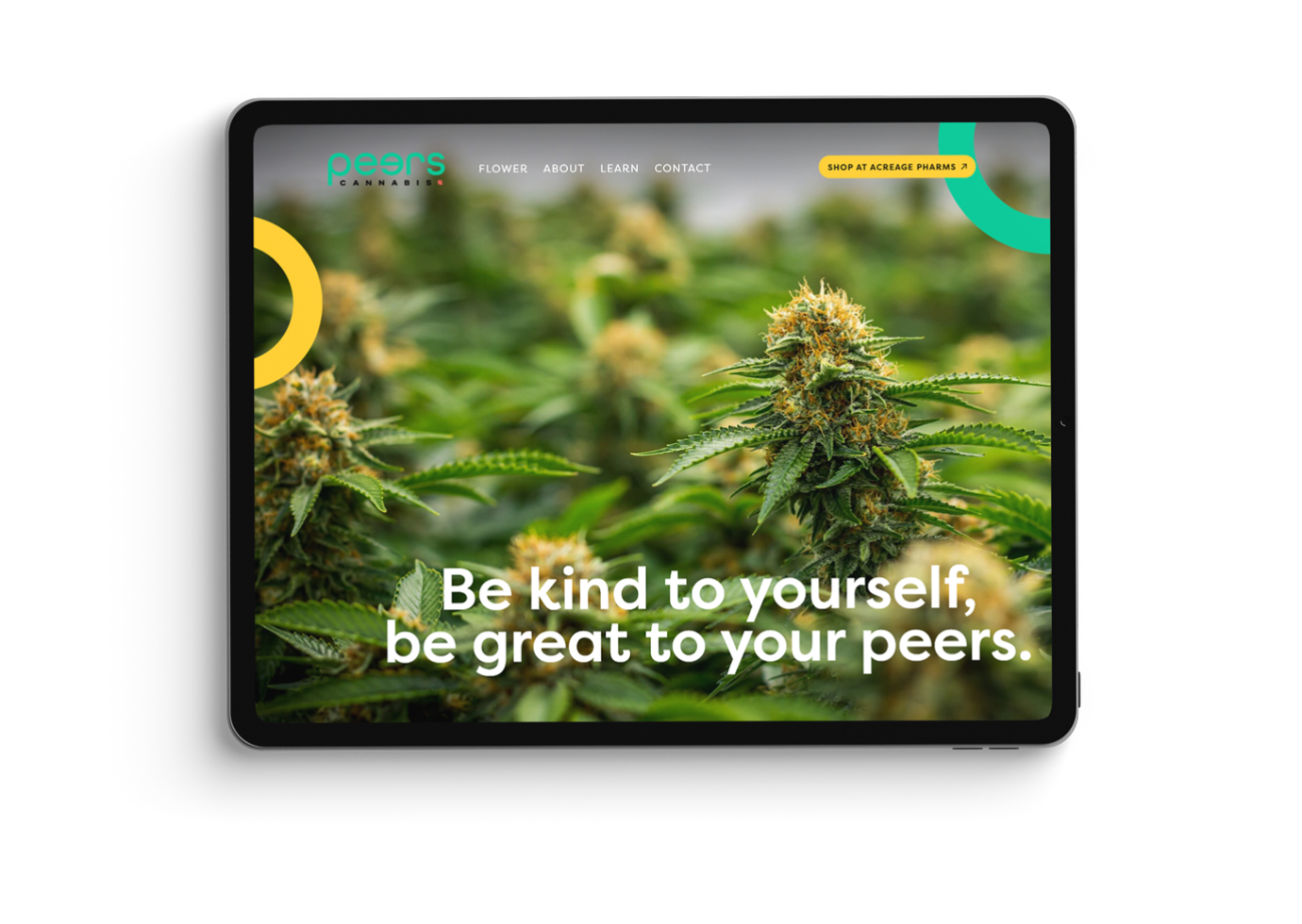
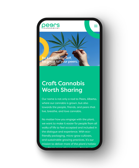
Website.
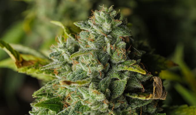
Showcasing the Best Flower Under the Sun
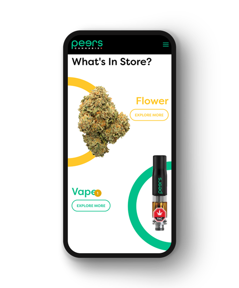
Core brand elements such as the Peers circle and contrasting colour scheme helped create an amicable and approachable environment for their portfolio website.
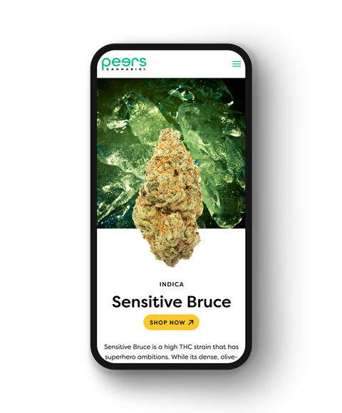
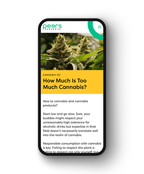
Peers Cannabis’ approach to craft cannabis is grounded in environmentalism, so we used succinct yet memorable copy to feature their eco-friendly grow story in their product pages in a non-imposing way that fit seamlessly across desktop and mobile platforms.
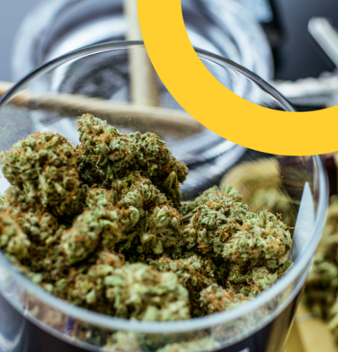
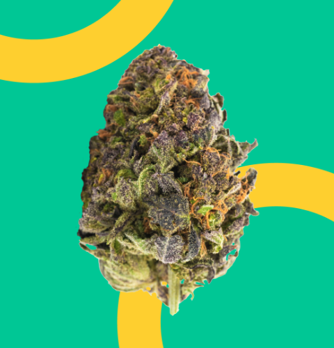
Building further onto Peer Cannabis’ core values, we used high-impact photography and visuals throughout their product catalogue to showcase the different flavours and aromas that users can expect from each selection.
Terpene profiles were also displayed alongside their naturally sourced counterparts to provide visitors with sensory visuals to further aid them in their purchasing decisions.
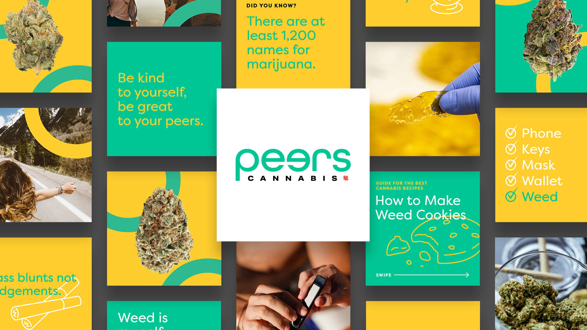
Social Media
Crisp & Captivating Content
Aligning Peers Cannabis’ inclusive brand story with restrictive compliance legislation while captivating target audiences presented a unique challenge. Social media is readily accessible, so we wanted that same level of accessibility to be expressed by Peers Cannabis’ social presence, too. We focused on eye-catching brand visuals and educational cards to help Peers Cannabis capture and hold audience attention, while also informing them of product information and offerings.
“Clout Brands translated our ideas into reality with incredible fluency. Everything about the branding, from the colour scheme to the logo, exudes the energy that we were looking to represent ourselves with.”
Robert Pridgen, Chief Marketing Officer of Peers Cannabis

Social Media
Crisp & Captivating Content
Aligning Peers Cannabis’ inclusive brand story with restrictive compliance legislation while captivating target audiences presented a unique challenge. Social media is readily accessible, so we wanted that same level of accessibility to be expressed by Peers Cannabis’ social presence, too. We focused on eye-catching brand visuals and educational cards to help Peers Cannabis capture and hold audience attention, while also informing them of product information and offerings.